
Two iconic yarns by Tollegno 1900—Harmony and Feeling—were also featured at the 15th Florence Biennale (October 18-26) thanks to the work created by Francesca Fiaschi, a visual artist and architect-urban planner with a solid background.
Francesca, what are the stages of your personal educational and creative journey that led you to create a work for the Florence Biennale?
My background combines architectural and artistic training in Italy with work and research experiences in Africa, Asia, and North America. The influence of these contexts is reflected in my work, where local colors and natural and urban landscapes are transformed into textures. Urban and abstract forms. I let myself be guided by color: whether multiple or reduced to binary contrasts, it is always the heart of my work. From there arise the shapes, textures, and choice of materials—paper, wood, plaster, canvas, and yarn—as well as pigments, ranging from oil to watercolor, from ink to digital colors, even those derived from spices like coffee, turmeric, paprika, and saffron.
So, travel is the essence of your journey…
Exactly. In 2014, I moved to Montreal. Here, I began working as an illustrator, and then explored printing and screen printing techniques, which paved the way for a broader practice, capable of intertwining visual arts, craftsmanship, and design. My architectural training and PhD in urban planning in Canada taught me to approach complexity methodically, transforming it into concrete solutions. This approach also informs my artistic work: chromatic analysis guides the choice of materials and the dialogue with artisans, but within this rational structure, it finds its I place intuition, which gives strength and uniqueness to each work.
A further step in your evolution is represented by CVD, Color Vision Deficiency…
Yes, especially in recent years I have focused on Color Vision Deficiency (CVD), to create works that are legible even in conditions of impaired vision. Today, my research on color composition involves textile craftsmanship, with materials such as cashmere, silk, wool, cotton, and acrylic, pushing color beyond the surface, towards an experience that is both visual and tactile.
This “journey” of growth also includes your participation in the Biennale that took place in Florence at the end of October. What is the name of the project you developed?
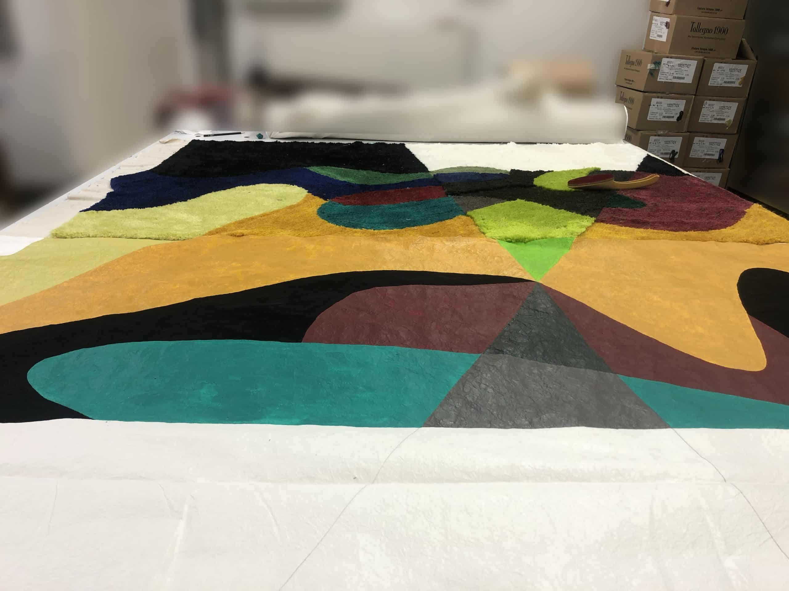
The project is titled Zones d’ambiguïté – Color and altered perception through paper and textile (2025). In Italian, it has been translated as “Zone di Ambiguità,” a Fiber Art work that originates from color studies on Japanese paper and takes shape in textiles, created on 100% cotton canvas through The needle tufting technique with extra-fine merino wool, cashmere, and silk, Italian yarns from Tollegno.
What inspired you to create it?
Zones d’ambiguïté was born from the idea of investigating how the same color, applied to different materials, can transform perception and alter the way we read shapes. The composition brings Japanese paper and textiles into dialogue: thanks to variations in density, weave, and relief in extra-fine merino wool, cashmere, and silk, color becomes material, revealing different visual and tactile sensations. The use of absolute black, which erases textures, introduces zones where perception becomes uncertain and disappears altogether. The work also includes the dimension of protanopic colorblind vision (red-green deficit) from the outset. In the optical cones, colors are translated into the values perceived by those who experience this condition, offering an alternative reading of shapes and thus generating the ambiguity that gives the work its title. A QR code accompanies the work and provides access to a space A virtual space, where the entire surface can be explored from a protanopic perspective: an immersive experience that contrasts real and altered perception.
If you had to explain your work to a visitor to the Biennale, how would you explain it?
It’s a textile work that explores the perception of color. At first glance, it seems like a dialogue between geometric shapes and precious materials, but in reality, it reveals that not everything we perceive in one way is “read” in the same way by others. Some areas of the work integrate colorblind vision, demonstrating how the same color can change meaning depending on the gaze. The QR code accompanies the work and opens to a virtual space where the entire composition can be seen with protanopic eyes. It’s not about standardizing perceptions, but about becoming aware of the differences and doing our best to Include them.
Among the yarns used, you chose two iconic Tollegno 1900 products. How did you come across the brand?
Through targeted research on top-quality Italian yarns. I’m a researcher, and it wasn’t hard for me to verify that Tollegno 1900 embodies all of this: a supply chain that combines innovation and tradition, perfect for transforming color into matter.
Which Tollegno 1900 yarn did you choose to make it, and why?
I primarily chose Harmony, 100% extra-fine merino wool. Its regularity and compactness allowed me to precisely control the density, weave, and height of the pile during the tufting process, ensuring stability and color uniformity. The decision was also guided by the wide range of colors already available in the Tollegno 1900 color palette, which allowed me to develop the desired variations without additional work.
But you also opted for a second yarn…
I also partially incorporated Feeling, a blend of 70% extra-fine merino, 20% silk, and 10% cashmere. In this combination, each fiber plays a specific role: the merino wool ensures compactness and structural regularity, the silk provides luminosity and color intensity, while the cashmere adds softness and tactile finesse. The combination of the three materials produces a balanced yarn, capable of enhancing both the sensory performance and the brilliance of the color contrasts.
The combined use of the two yarns created a balance between technical control, chromatic depth, and sensory quality, transforming color into a living material, as originally intended. A result I also owe to the expertise and quality of Tollegno 1900.
What characteristics of the yarn proved instrumental in the realization of your artistic project?
The characteristics that truly made the difference were the compactness, regularity, and uniform color rendering of Harmony’s extra-fine merino, which allowed me to work with pinpoint precision on the density, weave, and pile height. This control was essential to translate color variations into textural variations, without losing the clarity of the design.
In the case of Feeling, however, the combination with silk and cashmere added softness and shine, allowing the textile to convey not only color but also a richer sensorial quality. Light reacts differently on fibers, and this strengthened the color contrasts and nuances I wanted to achieve. Together, these properties enabled a balance between technical rigor and perception, transforming the yarn into a true expressive tool.
Are you already working on other projects that you’d like to share some details about?
Yes, I’m already working on new ones. I’m currently conducting color analyses on various materials, with yarns as the primary medium. Each yarn has its own texture and generates new ones during the weaving process: I’m interested in observing how color transforms in relation to these material variations and how this influences perception. I’m also studying new shades designed to respond to conditions of altered vision. We’ll soon see where this research leads: Tollegno 1900 will certainly remain in my thoughts for my future projects, and I can only thank them for the quality of the yarns they made available.

